UIStatusBar Theming Parameters
The UIStatusBar theming block id is 'status_bar'.
Colours
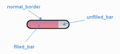
A diagram of which part of the element is themed by which colour parameter.
UIStatusBar makes use of these colour parameters in a 'colours' block:
"normal_border" - The colour/gradient of the health bar's border if it has one.
"filled_bar" - The colour/gradient of the actual bar itself, of the portion of it that is still full.
"unfilled_bar" - The colour/gradient of an empty portion of the health bar.
Misc
UIStatusBar has the following miscellaneous parameters in a 'misc' block:
"shape" - Can be one of 'rectangle' or 'rounded_rectangle'. Different shapes for this UI element.
"shape_corner_radius" - Only used if our shape is 'rounded_rectangle'. It sets the radius, or radii, used for the rounded corners. Use a single integer to set all corners to the same radius, or four integers separated by commas to set each corner individually.
"follow_sprite_offset" - The x,y offset values for when the bar follows a sprite. Defaults to "0,0".
"border_width" - The width of the border around the health bar. Defaults to "1". Can be "0" to remove the border.
"shadow_width" - The width of the border around the health bar. Defaults to "1". Can be "0" to remove the border.
"tool_tip_delay" - time in seconds before the button's tool tip (if it has one) will appear. Default is "1.0".
Example
Here is an example of a status bar block in a JSON theme file using the parameters described above.
 1 {
 2     "status_bar":
 3     {
 4         "colours":
 5         {
 6             "normal_border": "#AAAAAA",
 7             "filled_bar": "#f4251b",
 8             "unfilled_bar": "#CCCCCC"
 9         },
10         "misc":
11         {
12             "follow_sprite_offset": "-5, 32",
13             "border_width": "0"
14         }
15     }
16 }