UISelectionList Theming Parameters
UISelectionList theming block id is 'selection_list'.
Colours
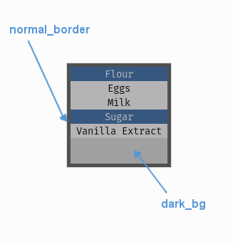
A diagram of which part of the element is themed by which colour parameter.
UISelectionList makes use of the following these colour parameters in
a 'colours' block. All of these colours can also be a colour gradient:
"dark_bg" - The background colour/gradient of the selection list element. Often you won't see this unless your list buttons are semi-transparent.
"normal_border" - The colour/gradient of the border around the selection list (if it has one).
Misc
UISelectionList accepts the following miscellaneous parameters in a 'misc' block:
"shape" - Can be one of 'rectangle' or 'rounded_rectangle'. Different shapes for this UI element.
"shape_corner_radius" - Only used if our shape is 'rounded_rectangle'. It sets the radius, or radii, used for the rounded corners. Use a single integer to set all corners to the same radius, or four integers separated by commas to set each corner individually.
"border_width" - The width of the border around the element in pixels. Defaults to "1".
"shadow_width" - The width of the shadow around the element in pixels. Defaults to "2".
"list_item_height" - The pixel height of a the items in the list. Defaults to "20".
"tool_tip_delay" - time in seconds before the button's tool tip (if it has one) will appear. Default is "1.0".
Sub-elements
The selection list may also contain a UIVerticalScrollBar which you
can reference with the block id 'window.vertical_scroll_bar'. You can also reference all of the buttons that are sub
elements of the scroll bar with a theming block id of 'window.vertical_scroll_bar.button', or pick out the list item
buttons specifically with a class_id of '@selection_list_item'.
You can further reference the individual buttons of the scroll bar by adding their object IDs:
'window.vertical_scroll_bar.#top_button'
'window.vertical_scroll_bar.#bottom_button'
'window.vertical_scroll_bar.#sliding_button'
There is more information on theming the vertical scroll bar at UIVerticalScrollBar Theming Parameters.
Example
Here is an example of a panel block in a JSON theme file, using the parameters described above.
 1 {
 2     "selection_list":
 3     {
 4         "colours":
 5         {
 6             "dark_bg":"#21282D",
 7             "normal_border": "#999999"
 8         },
 9
10         "background_image":
11         {
12             "path": "data/images/splat.png",
13             "sub_surface_rect": "0,0,32,32"
14         },
15
16         "misc":
17         {
18             "shape": "rounded_rectangle",
19             "shape_corner_radius": "10",
20             "border_width": "1",
21             "shadow_width": "15",
22             "list_item_height": "30"
23         }
24     },
25     "selection_list.@selection_list_item":
26     {
27         "misc":
28         {
29            "border_width": "2"
30         }
31     }
32 }