UIHorizontalScrollBar Theming Parameters
The UIHorizontalScrollBar theming block id is 'horizontal_scroll_bar'.
Colours
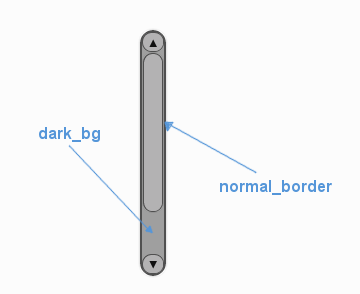
A diagram of which part of the element is themed by which colour parameter. The scroll bar's buttons are themed in a separate block.
UIHorizontalScrollBar makes use of these colour parameters in a 'colours' block. All of these colours can
also be a colour gradient:
"dark_bg" - The background colour/gradient of the 'back' of the scroll bar, the colour of the track that the scroll bar moves along.
"normal_border" - The colour/gradient of the border around the scroll bar.
"disabled_dark_bg" - The colour/gradient of the track when disabled.
"disabled_border" - The border colour/gradient of the slider when disabled.
Misc
UIHorizontalScrollBar accepts the following miscellaneous parameters in a 'misc' block:
"shape" - Can be one of 'rectangle' or 'rounded_rectangle'. Different shapes for this UI element.
"shape_corner_radius" - Only used if our shape is 'rounded_rectangle'. It sets the radius, or radii, used for the rounded corners. Use a single integer to set all corners to the same radius, or four integers separated by commas to set each corner individually.
"border_width" - the width in pixels of the border around the bar. Defaults to 1.
"shadow_width" - the width in pixels of the shadow behind the bar. Defaults to 1.
"enable_arrow_buttons" - Enables or disables the arrow buttons for the scroll bar. "1" is enabled, "0" is disabled. Defaults to "1".
"tool_tip_delay" - time in seconds before the scroll bar's tool tip (if it has one) will appear. Default is "1.0".
Sub-elements
You can reference all three of the buttons that are sub elements of the scroll bar with a theming block id of 'horizontal_scroll_bar.button'. You can reference both of the arrow buttons with the class_id: '@arrow_button'. You can also reference the three buttons individually by adding their object IDs:
'horizontal_scroll_bar.#left_button'
'horizontal_scroll_bar.#right_button'
'horizontal_scroll_bar.#sliding_button'
There is more information on theming buttons at UIButton Theming Parameters.
Example
Here is an example of some horizontal scroll bar blocks in a JSON theme file, using the parameters described above (and some from UIButton).
 1 {
 2     "horizontal_scroll_bar":
 3     {
 4         "colours":
 5         {
 6             "normal_bg": "#25292e",
 7             "hovered_bg": "#35393e",
 8             "disabled_bg": "#25292e",
 9             "selected_bg": "#25292e",
10             "active_bg": "#193784",
11             "dark_bg": "#15191e",
12             "normal_text": "#c5cbd8",
13             "hovered_text": "#FFFFFF",
14             "selected_text": "#FFFFFF",
15             "disabled_text": "#6d736f"
16         },
17         "misc":
18         {
19            "shape": "rectangle",
20            "border_width": "0",
21            "enable_arrow_buttons": "1"
22         }
23     },
24     "horizontal_scroll_bar.button":
25     {
26         "misc":
27         {
28            "border_width": "1"
29         }
30     },
31     "horizontal_scroll_bar.@arrow_button":
32     {
33         "misc":
34         {
35            "shadow_width": "0"
36         }
37     },
38     "horizontal_scroll_bar.#sliding_button":
39     {
40         "colours":
41         {
42            "normal_bg": "#FF0000"
43         }
44     }
45 }