UIDropDownMenu Theming Parameters
The UIDropDownMenu theming block id is 'drop_down_menu'.
Colours
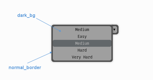
A diagram of which part of the element is themed by which colour parameter. In the drop down menu it will only be possible to see the 'dark_bg' themed regions when the buttons in the menu are themed to be transparent, or semi transparent themselves.
UIDropDownMenu makes use of these colour parameters in a 'colours' block. All of these colours can
also be a colour gradient:
"dark_bg" - The background colour/gradient of the drop down menu. Probably not visible.
"normal_border" - The border colour/gradient of the drop down menu.
"disabled_dark_bg" - The colour/gradient of the menu background when disabled.
"disabled_border" - The border colour/gradient of the menu when disabled.
Misc
UIDropDownMenu accepts the following miscellaneous parameters in a 'misc' block:
"shape" - Can be one of 'rectangle' or 'rounded_rectangle'. Different shapes for this UI element.
"shape_corner_radius" - Only used if our shape is 'rounded_rectangle'. It sets the radius, or radii, used for the rounded corners. Use a single integer to set all corners to the same radius, or four integers separated by commas to set each corner individually.
"expand_direction" - Can be set to 'up' or 'down'. Defaults to 'down'. Changing this parameter will change the direction that the menu will expand away from the initial starting point.
"border_width" - the width in pixels of the border around the drop down menu. Defaults to "1".
"shadow_width" - the width in pixels of the shadow behind the button. Defaults to "1".
"open_button_width" - the width of the open/close button on the right hand side of the drop down. Defaults to "20" (pixels). Set it to "0" to remove the open/close button.
"tool_tip_delay" - time in seconds before the button's tool tip (if it has one) will appear. Default is "1.0".
Sub-elements
You can reference all of the buttons that are sub elements of the drop down menu with a theming block id of 'drop_down_menu.button'. You can also reference the buttons individually by adding their object IDs:
'drop_down_menu.#expand_button'
'drop_down_menu.#selected_option'
There is a also a selection list that manages the options when the drop down is expanded, you can reference that with:
'drop_down_menu.#drop_down_options_list'
Or the individual option buttons with:
'drop_down_menu.#drop_down_options_list.button'
There is more information on theming buttons at UIButton Theming Parameters and selection lists at :ref: theme-selection-list.
Example
Here is an example of a drop down menu block in a JSON theme file, using the parameters described above (and a couple from UIButton).
 1 {
 2     "drop_down_menu":
 3     {
 4         "misc":
 5         {
 6             "expand_direction": "down"
 7         },
 8
 9         "colours":
10         {
11             "normal_bg": "#25292e",
12             "hovered_bg": "#35393e"
13         }
14     },
15     "drop_down_menu.#selected_option":
16     {
17         "misc":
18         {
19            "border_width": "1",
20            "open_button_width": "10"
21         }
22     }
23 }