UIPanel Theming Parameters
The UIPanel theming block id is 'panel'.
Colours
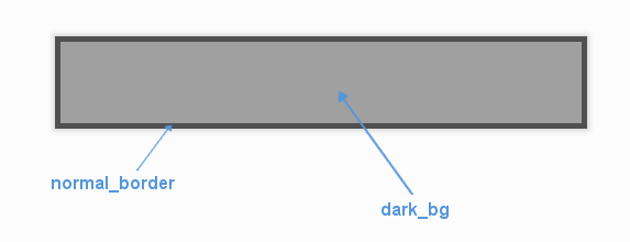
A diagram of which part of the element is themed by which colour parameter.
UIPanel makes use of the following these colour parameters in a 'colours' block.
All of these colours can also be a colour gradient:
"dark_bg" - The background colour/gradient of the panel element.
"normal_border" - The colour/gradient of the border around the panel (if it has one).
Images
UIPanel accepts images specified in the theme via an 'images' block. The panel supports both single-image and multi-image modes for enhanced visual effects.
Single Image Mode (Legacy)
For simple panels with one background image, use this parameter:
"background_image" - The image displayed on the panel. It has the following block of sub-parameters:
"position" - Optional tuple of (x, y) values between 0.0 and 1.0 representing relative position. Defaults to (0.5, 0.5) for center.
"path" - The string path to the image to be displayed. OR
"package - The name of the python package containing this resource - e.g. 'data.images'
"resource - The file name of the resource in the python package - e.g. 'splat.png' - Use a 'package' and 'resource' or a 'path' not both.
"sub_surface_rect" - An optional rectangle (described like "x,y,width,height") that will be used to grab a smaller portion of the image specified.
"premultiplied" - Optional parameter to declare that a loaded image already contains premultiplied alpha and does not need premultiplying. Set to "1" to enable, "0" to disable (default).
Multi-Image Mode (New)
For advanced panels with layered visual effects, use this parameter to specify multiple background images:
"background_images" - A list of images displayed on the panel, rendered in layer order. Each image in the list has these sub-parameters:
"id" - A unique identifier for this image layer (e.g., "background", "texture", "overlay").
"layer" - The rendering layer order (lower numbers render first/behind, higher numbers render last/on top).
"position" - Optional tuple of (x, y) values between 0.0 and 1.0 representing relative position. Defaults to (0.5, 0.5) for center.
"path" - The string path to the image to be displayed. OR
"package - The name of the python package containing this resource - e.g. 'data.images'
"resource - The file name of the resource in the python package - e.g. 'splat.png' - Use a 'package' and 'resource' or a 'path' not both.
"sub_surface_rect" - An optional rectangle (described like "x,y,width,height") that will be used to grab a smaller portion of the image specified.
"premultiplied" - Optional parameter to declare that a loaded image already contains premultiplied alpha and does not need premultiplying. Set to "1" to enable, "0" to disable (default).
Image Mode Notes:
The panel automatically detects whether to use single-image or multi-image mode based on the parameters provided.
Multi-image mode allows for complex visual effects like layered backgrounds, textures, patterns, and overlays.
Images are rendered in layer order (lowest layer number first), allowing precise control over visual composition.
Both modes support image positioning for precise control over where images appear within the panel.
Position values are relative coordinates between 0.0 and 1.0, where: - (0.0, 0.0) represents the top-left corner - (1.0, 0.0) represents the top-right corner - (0.0, 1.0) represents the bottom-left corner - (1.0, 1.0) represents the bottom-right corner - (0.5, 0.5) represents the center (default)
Misc
UIPanel accepts the following miscellaneous parameters in a 'misc' block:
"shape" - Can be one of 'rectangle' or 'rounded_rectangle'. Different shapes for this UI element.
"shape_corner_radius" - Only used if our shape is 'rounded_rectangle'. It sets the radius, or radii, used for the rounded corners. Use a single integer to set all corners to the same radius, or four integers separated by commas to set each corner individually.
"border_width" - The width of the border around the element in pixels. Defaults to "1".
"shadow_width" - The width of the shadow around the element in pixels. Defaults to "2".
"tool_tip_delay" - time in seconds before the button's tool tip (if it has one) will appear. Default is "1.0".
Example
Here are examples of panel blocks in JSON theme files using the parameters described above.
Single Image Mode Example:
 1 {
 2     "panel":
 3     {
 4         "colours":
 5         {
 6             "dark_bg":"#21282D",
 7             "normal_border": "#999999"
 8         },
 9         "images":
10         {
11             "background_image":
12             {
13                 "package": "data.images",
14                 "resource": "splat.png",
15                 "sub_surface_rect": "0,0,32,32"
16             }
17         },
18         "misc":
19         {
20             "shape": "rounded_rectangle",
21             "shape_corner_radius": "10",
22             "border_width": "1",
23             "shadow_width": "15"
24         }
25     }
26 }
Multi-Image Mode Example:
 1 {
 2     "panel":
 3     {
 4         "colours":
 5         {
 6             "dark_bg":"#21282D",
 7             "normal_border": "#999999"
 8         },
 9         "images":
10         {
11             "background_images": [
12                 {
13                     "id": "base_texture",
14                     "path": "images/panel_base.png",
15                     "layer": 0
16                 },
17                 {
18                     "id": "pattern_overlay",
19                     "path": "images/panel_pattern.png",
20                     "layer": 1
21                 },
22                 {
23                     "id": "border_decoration",
24                     "path": "images/panel_border.png",
25                     "layer": 2
26                 }
27             ]
28         },
29         "misc":
30         {
31             "shape": "rounded_rectangle",
32             "shape_corner_radius": "10",
33             "border_width": "1",
34             "shadow_width": "15"
35         }
36     }
37 }
Multi-Image Mode Example with Positioning:
 1 {
 2     "panel":
 3     {
 4         "colours":
 5         {
 6             "dark_bg":"#21282D",
 7             "normal_border": "#999999"
 8         },
 9         "images":
10         {
11             "background_images": [
12                 {
13                     "id": "background",
14                     "path": "data/images/background.png",
15                     "layer": 0,
16                     "position": [0.5, 0.5]  // Centered
17                 },
18                 {
19                     "id": "top_left_logo",
20                     "path": "data/images/logo.png",
21                     "layer": 1,
22                     "position": [0.0, 0.0]  // Top-left corner
23                 },
24                 {
25                     "id": "bottom_right_watermark",
26                     "path": "data/images/watermark.png",
27                     "layer": 2,
28                     "position": [1.0, 1.0]  // Bottom-right corner
29                 }
30             ]
31         },
32         "misc":
33         {
34             "shape": "rounded_rectangle",
35             "shape_corner_radius": "10",
36             "border_width": "1",
37             "shadow_width": "15"
38         }
39     }
40 }